This was an ad hoc project requested last minute from the client. It's design was loosely based on another post with the same general feel, but this look is unique to this content. I pulled the colors from the legendary band's branding and kept the visual components as simple as possible to allow the audience to focus on the words shared by Peter Townshend.
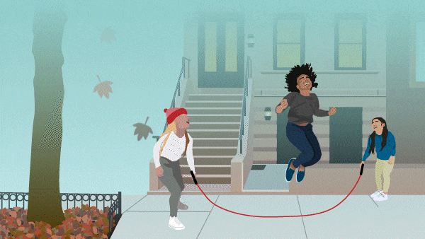
A simple animation for a testing plan Audible was deploying.
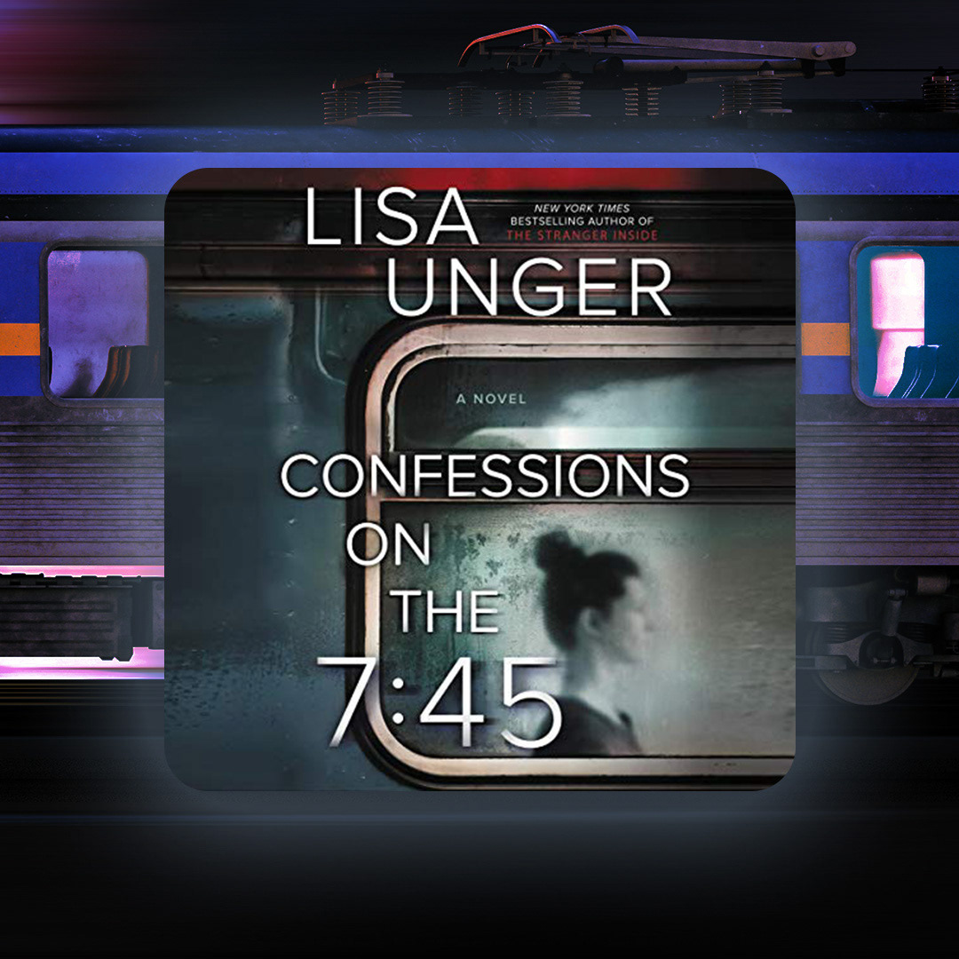
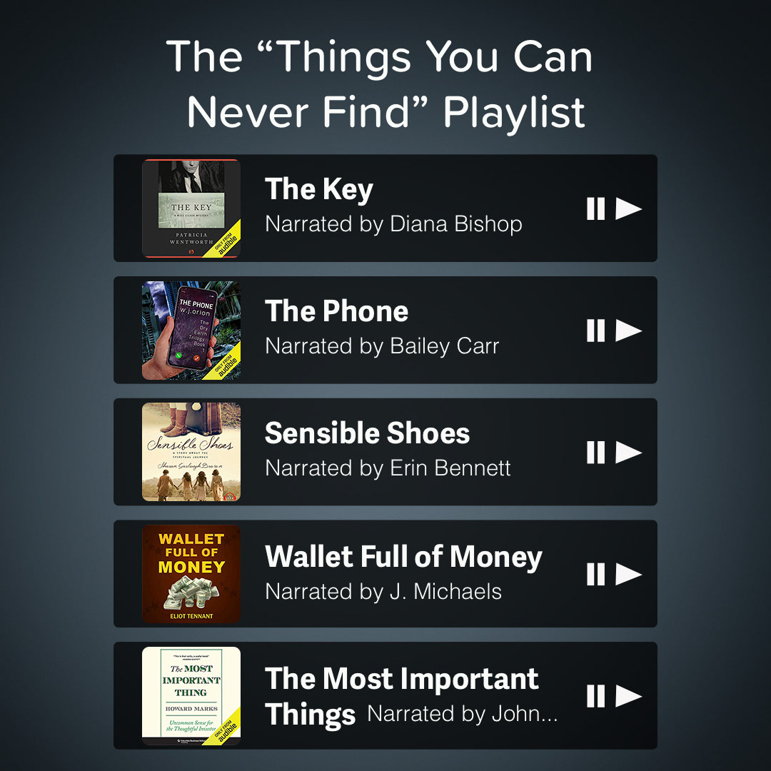
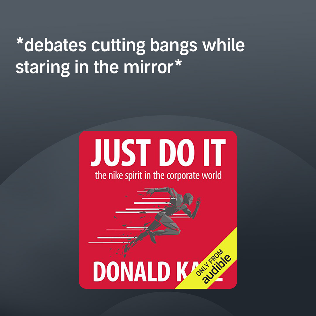
Colors were changed to fit more in theme with the brand's consistent dark colors.
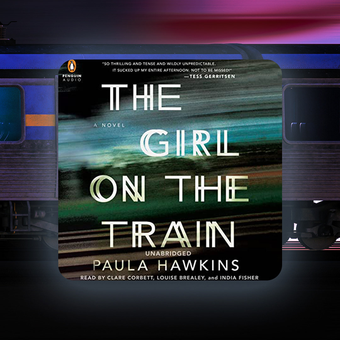
Colors were changed to fit more in theme with the brand's consistent dark colors.
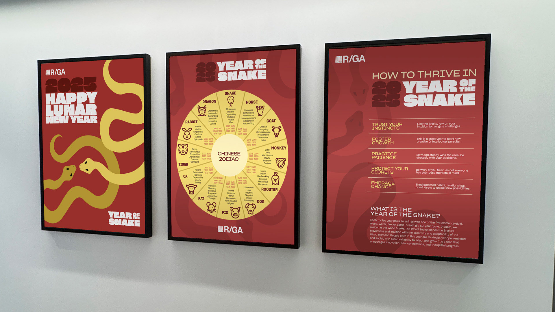
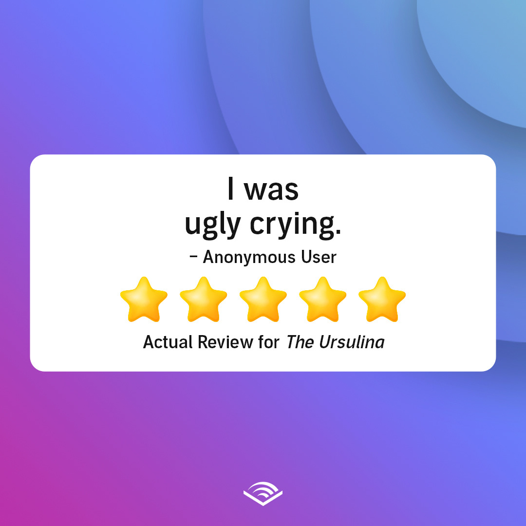
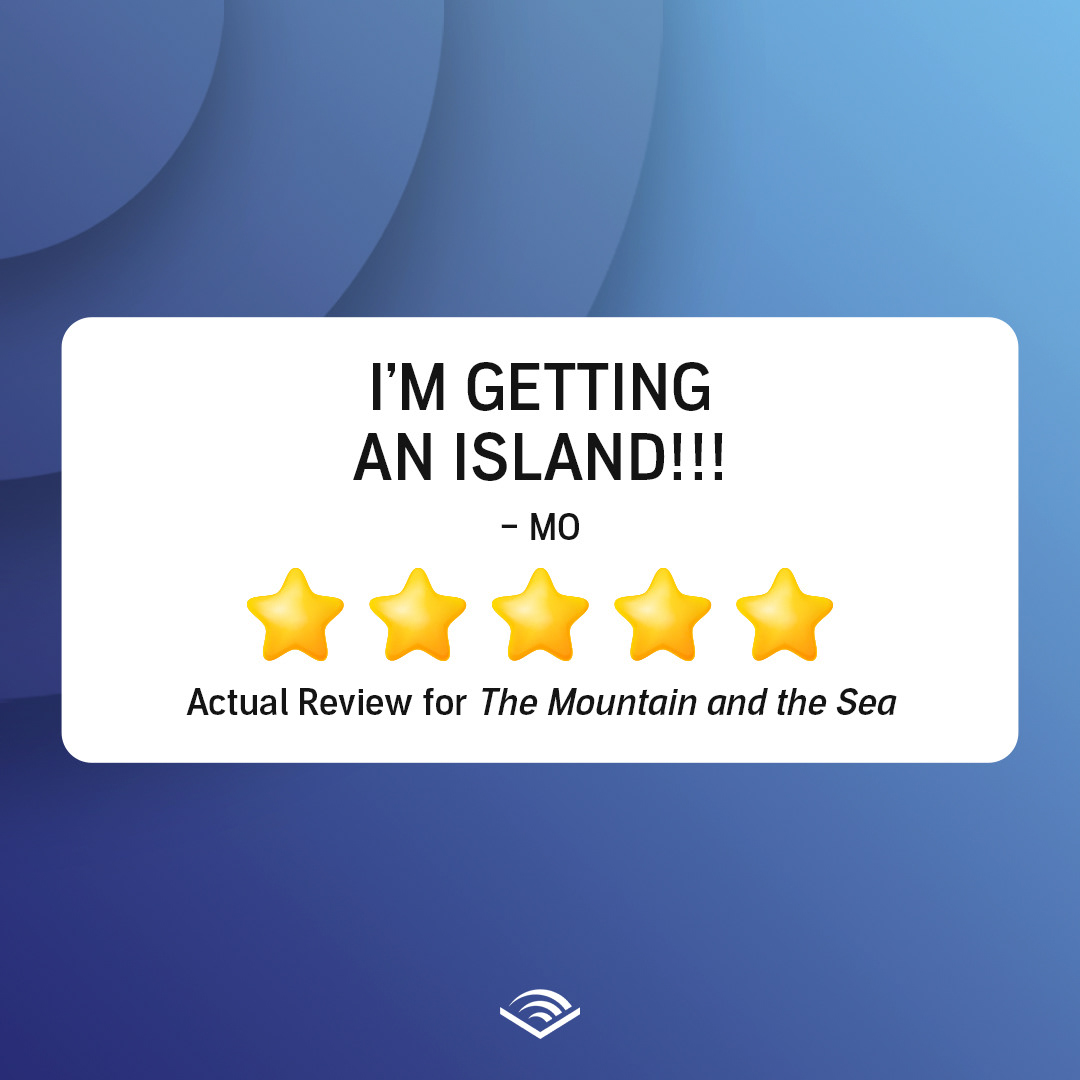
This carousel post is based on a template the client's in-house designers created for us to use.

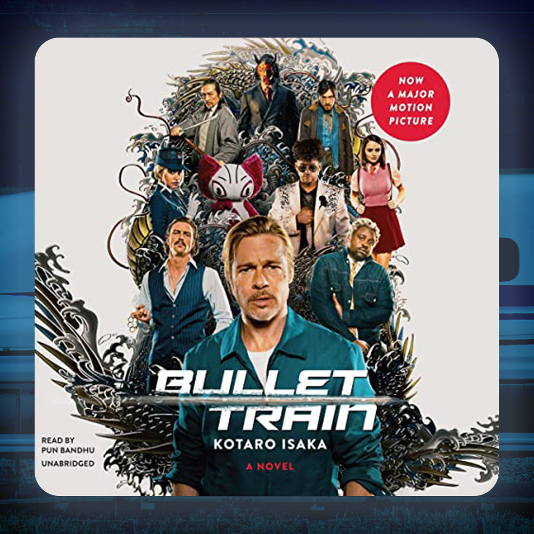
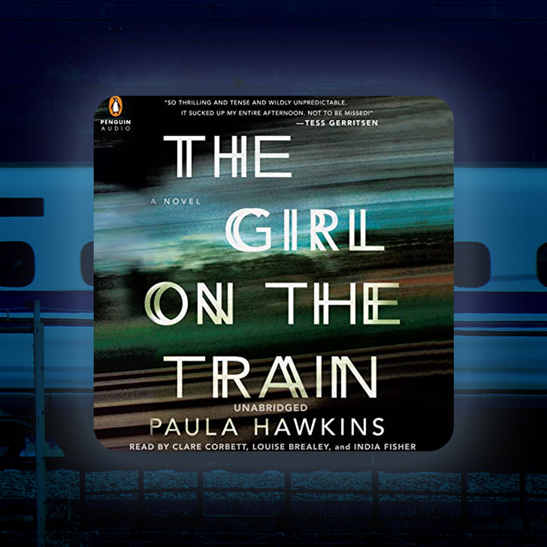
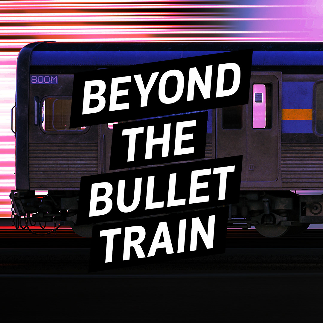
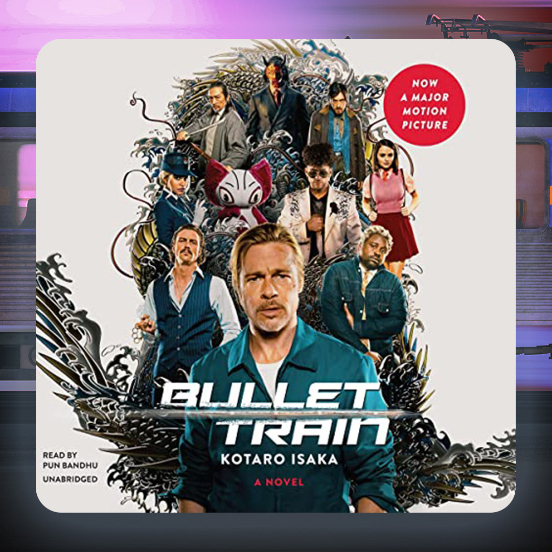
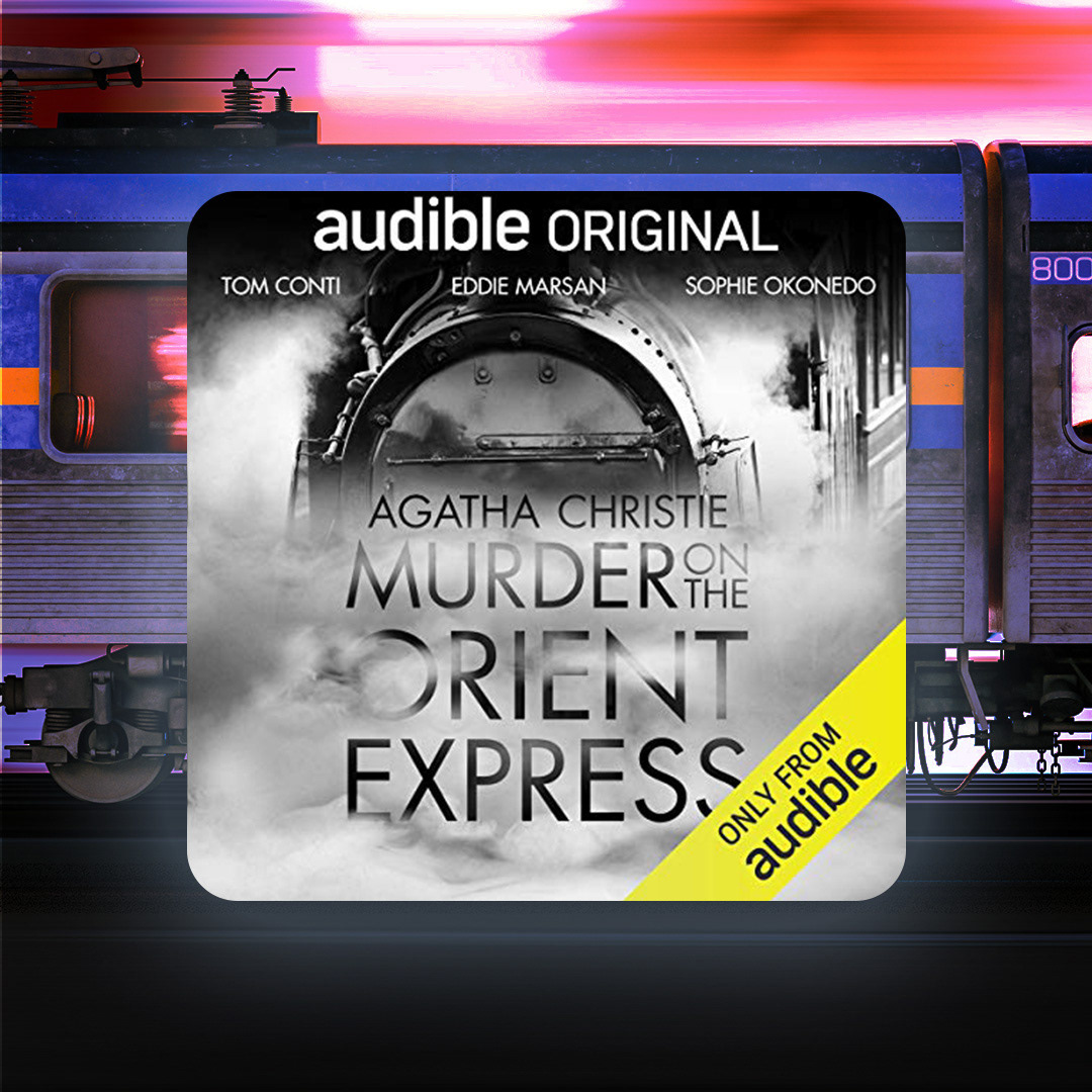
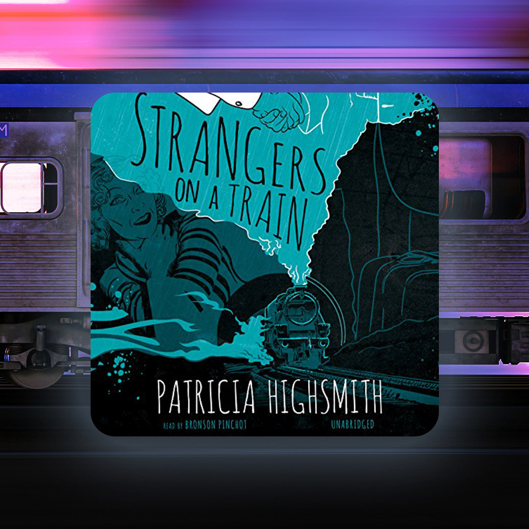
Bullet Train post with two iterations for carousel to provide options to the client.